COLORS IN ACTION
Within seconds of seeing your brand, customers have already made a subconscious decision about your business. Color acts as a silent language, instantly shaping how people perceive your brand. Certain colors naturally trigger emotional responses.
Blue is often associated with trust, dependability, and professionalism, which is why many financial institutions, healthcare companies, and technology brands use it to represent themselves.


Red creates excitement, urgency, passion, and energy. It naturally attracts attention and can even stimulate appetite, making it a common choice in food, retail, and entertainment marketing.
Green is commonly connected with freshness, growth, wellness, and balance, which is why it naturally aligns with industries that emphasize care, progress, and long-term value. It is often used by environmental organizations, sustainable product brands, agricultural companies, and investment firms that want to reflect stability and responsible growth.


Black often communicates sophistication, exclusivity, and luxury. It is widely used in high-end fashion houses, luxury automotive brands, premium cosmetics, and upscale hospitality businesses where a strong sense of elegance and authority is important to the brand identity.
Yellow tends to create feelings of optimism and energy because it is one of the first colors the human eye notices quickly. This makes it a popular choice for transportation and logistics companies, children-focused brands, creative agencies, and promotional campaigns that need to instantly capture attention and stand out.

These responses happen subconsciously. Color plays a major role in shaping that perception. We all know brands that are recognizable instantly without needing to display their full logo because the colors themselves already carry familiarity. People remember brands when their colors are distinctive and consistently used across different customer touchpoints.
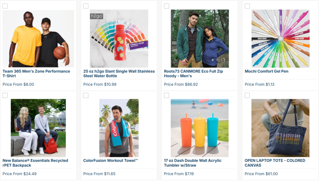
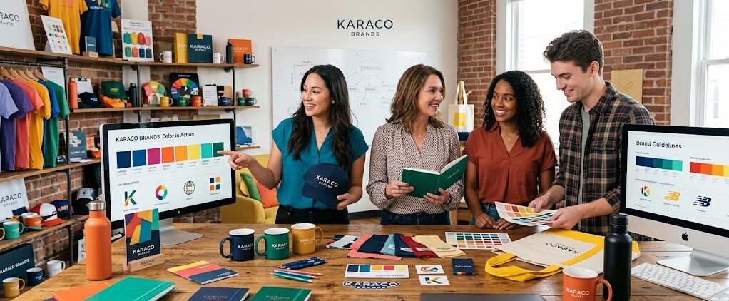
In branding, we do this by using the universally recognized PMS colors (Pantone Matching System). This system lets you communicate your brand identity concisely to printers who bring your brand to life in tangible everyday promotional products.
Every time someone uses a branded item, color reinforces how customers feel about it. Color encapsulates the consumer’s experience of the brand.
-Kara